Portfolio
Ignite Recognition
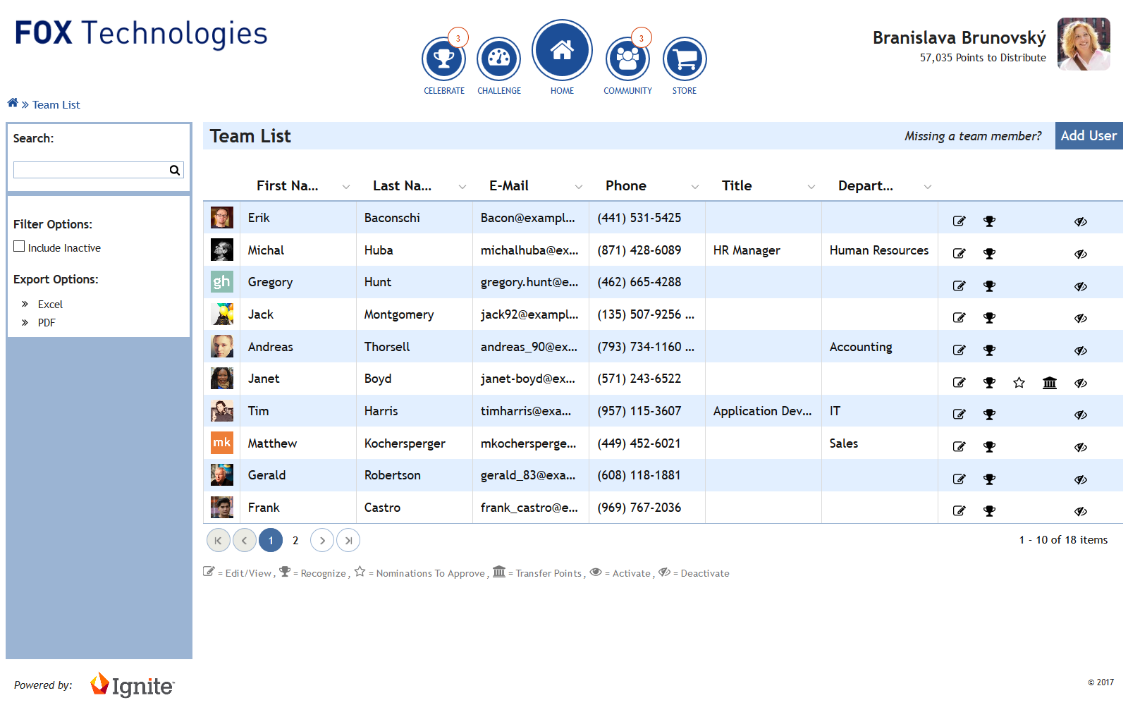
The Problem Space:
Combine a social news feed, e-commerce site and the tools to allow clients of various sizes to create multiple types of programs with terms such as “desktop only”, “minimum screen resolution” and “above the fold only”— Ignite was suffering due to concepts from the mid-nineties in a responsive mobile first world and stakeholders wanting to help were focused on the topic of color.
The Request:
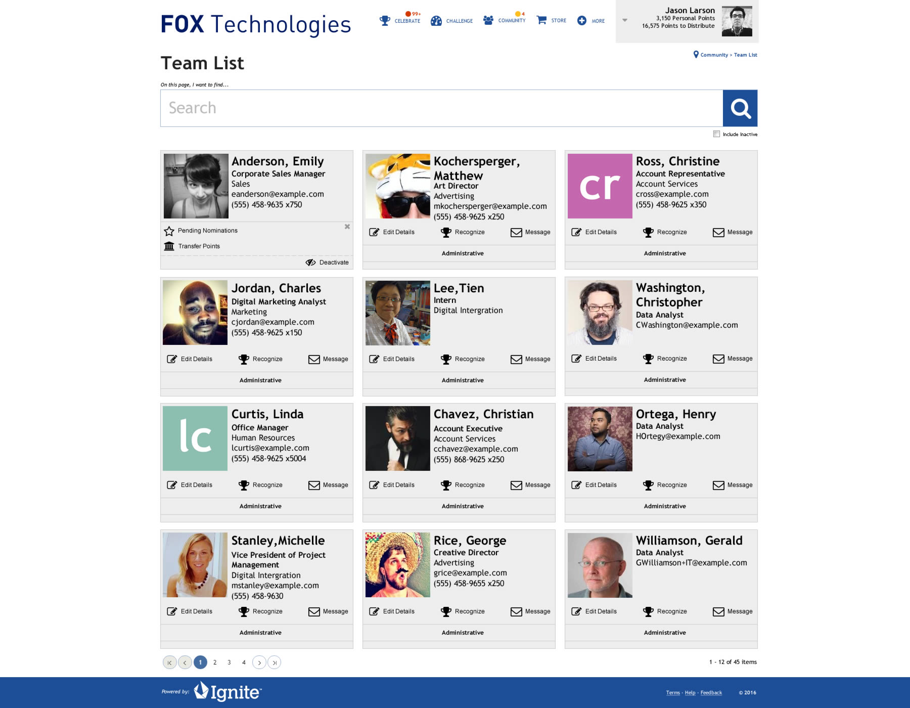
To aid stakeholders understand the underlying problem with Ignite, it was requested that I create a redesign of Ignite which kept the same color scheme and typography in a very short deadline.
Color Palette:
- Brand Color - Primary
#1C4E97 - Brand Color - Secondary
#9BB4D3 - Brand Color - Tertiary
#E2EFFF - Neutral Color
#FFFFFF - Utility Color - Alert
#FFBF20 - Utility Color - Negative
#D43900
Suggested Modification:
- Brand Color - Tertiary
#E2EFFF - Neutral Color
#EEEEEE
The Alignment:
Showing the small proof of concept which was not too disruptive of a change with a minimal grid structure that users on social media sites were accustomed to seeing helped stakeholders to understand how individual profile cards could stack in a smaller viewport.
Stakeholders not feeling overwhelmed by jargon and other technical terms by being able to "see" a proposed alternative allowed for a more positive discussion. This allowed stakeholders to come to the alignment that while the aesthetics appeal was important there were some foundational problems which needed to be addressed first.
All product names, logos, and brands are property of their respective owners. All work created and distributed while working at Touchstone Group Associates, LLC.