Portfolio
Ignite Recognition
The web should be usable for everyone.
“What if someone doesn’t browse the web like I do? ” — Ethan Marcotte
When it comes to people, there’s no such thing as “normal.” As designers, it’s our responsibility to recognized mismatched interactions and know how our design affact these who use what we create.
Keyboard Only Testing
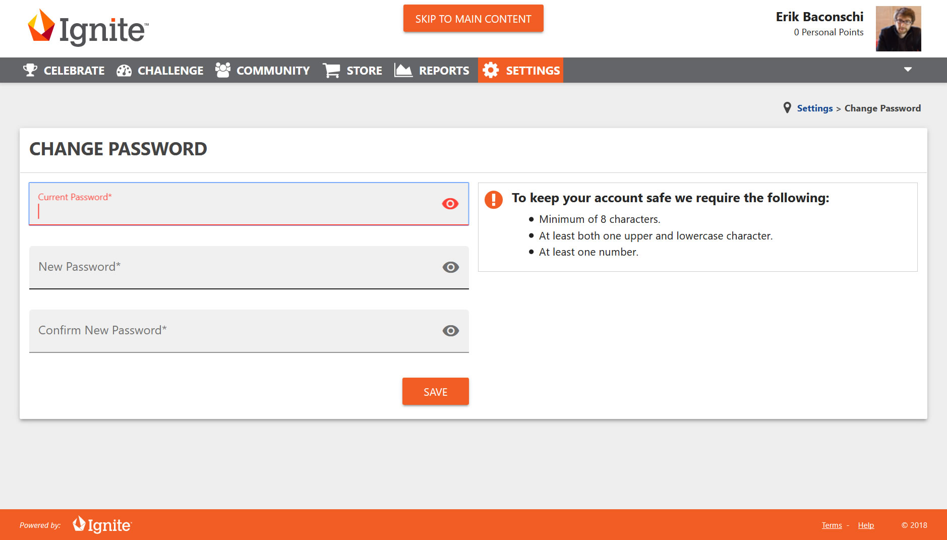
For those who have limited mobility it can be very frustration to repeatedly tab through navigation links to get to the main content of a page.
To ensure that keyboard users could access Ignite, I made sure to add skip navigation links and tested that interactive elements were functional using only the keyboard for input — pressing tab to move focus between elements, pressing enter or space triggered interaction and that modals could be dismissed by esc. Finally, I restored the browser focus outline that were removed by third party components or provided alternate styling to such elements.
Color blindness
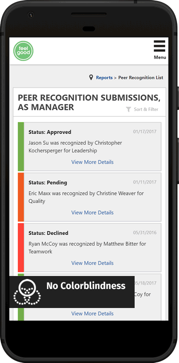

Around 1 in 12 men and 1 in 200 women have some form of color blindness. A color blindness simulator was used to test if colorblind users might have difficulties telling apart colors and patterns/additional styling was added so that color was not the only visual means of conveying information.
High Contrast
Most operating systems provide a mechanism to heighten the contrast on the screen by changing the screen colors which benefits users with low vision or other visual disabilities.
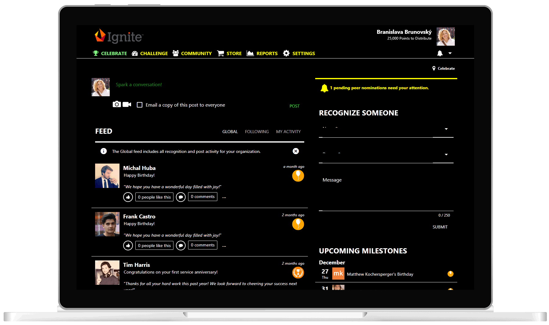
This mechanism overrides a website’s colors with colors which were selected by the user— meaning element’s backgrounds may not be visible in high contrast mode and the focus should be on functionality rather than a specific color.
Mobile Menu Improvements
When viewing the mobile menu in high contrast mode the hamburger and close icon would disappear.
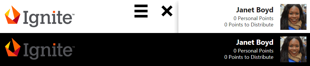
Adding a label helps make it more obvious that it toggles a menu and it can be viewed in high contrast mode.
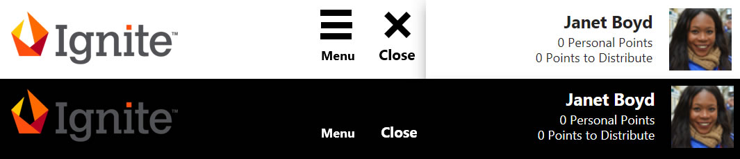
Finally, adding a transparent border allows for the hamburger and close icon to be visible in high contrast mode.
Input Fields Adjustments
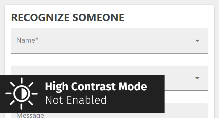
High Contrast mode testing revealed that inputs were no longer usable— in most cases the labels were covered by the input fields until a user interacted with the input. To make things even more challenging, a fix for the Firefox browser would conflict with the Edge browser and viceversa, meaning the fix had to be carefully constructed and tested.
Optimized View

Screen Reader Testing
While testing for color blindness and high contrast are visual, testing with screen readers on the other hand is not.
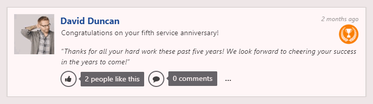
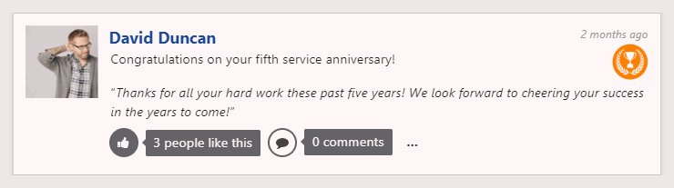
For this example the focus will be on the interaction of “liking” a feed post and the feedback from a screen reader.
Designing the invisible
Before:
| Scenario | NVDA Screen Reader Results |
|---|---|
| Feed Post Unliked | “Button Like” |
| Feed Post Liked | “Button Unlike” |
After:
| Scenario | NVDA Screen Reader Results |
|---|---|
| Feed Post Unliked | “Toggle Button Not Pressed. Click this button to like this post.” |
| Feed Post Liked | “Toggle Button Pressed. You currently like this post. Click this button to unlike it.” |
A small change resulted in more detailed feedback to a user not only telling them the status of the button but also the action they can take and what to expect from the result.
All product names, logos, and brands are property of their respective owners. All work created and distributed while working at Touchstone Group Associates, LLC. Keyboard icon by Arshit Patel from the Noun Project. Colorblindness icon by HeadsOfBirds from the Noun Project. Contrast icon by Vaibhav Radhakrishnan from the Noun Project.